Clip Studio Asset Store Redesign
Team
Dianne Natanauan, Lynna Nguyen, Vicky Wang, Helen Xie
Timeline
10 weeks:
January - March 2025
Background
Clip Studio Paint (often referred to as CSP by its community) is a family of software applications used mostly by professional artists, freelance illustrators, and hobby artists for the creation of comics, general illustrations, and animation. One of CSP’s biggest strengths over competitors is its Asset Store, which allows members of their extensive community to create custom materials in the form of brushes, general illustration materials, 3D objects, and much more for others to use at varying price points set by the artist who created them.
Clip Studio Assets is adored by many users in the CSP community, but it lacks in many ways for people who work with assets frequently. After speaking to a freelance illustrator who uses CSP everyday to work on various projects commissioned by clients, we came to understand these challenges in more detail and explored opportunities that would address them.
User Research Methods
Who was our professional of interest?
We interviewed a freelance illustrator who creates graphic design projects for various clients. These clients range from content creators to larger organizations like professional esports teams. Her final deliverables are usually a mix of illustration and graphic design, created using tools like Clip Studio Paint, OBS, PureRef, and Figma.
Procedure
During a 1 hour semi-structured interview, we asked questions that focused on understanding the illustrator’s workflow and what challenges they might face with the tools they use. We asked extra questions to elaborate on their answers if we felt it was necessary. Lastly, if possible, we asked to observe the interviewee go through their workflow or the process of a recent project.
GENERAL QUESTIONS
- What is your occupation?
- Can you briefly describe your role and daily responsibilities?
WORKFLOW AND TECHNOLOGY USAGE
- Can you give us an overview of what you do in a typical workweek?
- What tools (digital or otherwise) do you use to accomplish these tasks?
- What primary devices do you use the most frequently for work?
- Which software and applications do you rely on the most, and why?
- What do you like the most about it?
CHALLENGES AND PAIN POINTS
- What functionalities do you enjoy using in this software, and why?
- What kinds of problems or frustrations do you encounter when using these tools?
- Are there any specific features that you find unnecessary or hard to use?
- What features in the software do you wish to alter for a smoother workflow, if you can redesign your tool?
- What would the ideal tool or software for your work look like?
- Are there cases where you believe you can achieve a task more efficiently than the software?
WORKAROUNDS AND ALTERNATIVES
- Have you tried other software or tools for your work? If so, why did you switch or stop using them?
- Are there tasks you currently do manually that you wish could be automated or simplified?
- How do you see your work or the tools you use evolving in the next few years? Like do you think it could be replaced or keep its position as an industry standard?
- Do you use workarounds to accomplish tasks your current tools don’t support? If so, what are those workarounds?
SCENARIOS AND ALTERNATIVES
- (example to start) When you are given a new project to work on, what are the first steps you take?
- If you are able to, would you be able to share your screen on a previous project so we can see how everything you described to us today has been applied previously?
User Research Findings
Main insights
Our freelance illustrator described a schedule that is relaxed but requires checking client communications frequently. Oftentimes, since she is contracted, she is the main designer or artist on a project. She enjoys being involved in communities where artists create projects together.
- Clip Studio Paint (CSP) is their main workspace - no use of other drawing software
- Downloads many assets from the Clip Studio Asset store
- In constant communication with clients in case of last-minute revisions
- Involved in personal projects such as zines or merchandise collaborations with other artists
- Uses Discord and Email for communication
- Uses Google Drive to transfer files
As an avid Clip Studio Paint user, her favorite features of the software were the wide range of assets created by members of the community, the ability to personalize and customize her drawing workspace, and constant updates that create unique tools not found in other software.
Main challenges
Sarah’s main issue was the lack of organization available in the CSP asset store. She mentioned that she often browses the store and saves assets for future projects where she might need them. However, it is difficult to go back later and find these assets because there is no organization available on the website. She has to go through all the multiple pages of her downloads to find it. Sarah noted that sometimes she’ll take a guess, “How long ago did I download this?”, and then click on a page that might approximate that time frame. She also runs into this issue when trying to share tools with other members of her communities who might want to use the tool for their projects or collaborations.
Because she is freelance, she has to be able to respond to clients flexibly. This means that she wants to be able to work on projects while out of town or traveling. While Clip Studio Paint has a “Save to Cloud” feature that is shared across devices, she finds it inconvenient and prefers to share files on Google Drive or Discord. When asking her to demonstrate how to use the cloud, she was unsure and had to try multiple times to find the correct page. She didn’t feel motivated to try and save projects to the cloud and thought there was no point when Google Drive was more convenient.
Clip Studio Paint itself is already a very powerful and cohesive application, and its incredible personalization options mean that users can fix any possible interface issues themselves. However, we noticed issues with the external tools integrated with CSP, such as the asset store and the cloud feature. We are interested in how we can improve the workflow of artists in regards to accessing tools and files more easily so they can get back to the most important part of their work: drawing.
Our problem statement:
Illustrators need a low maintenance organizational system that will allow them to create, use, and share tools with their peers so that they can continue improving their toolkits and share their knowledge with their artist community.
User Flows and UI Sketches
Since we wanted to focus on how artists could work with their community through shared resources, we considered two redesigned flows below that represent two aspects of the current Clip Studio workspace. These flows were created with our two personas in mind, with Lee representing a digital art beginner and Lucia representing a professional.
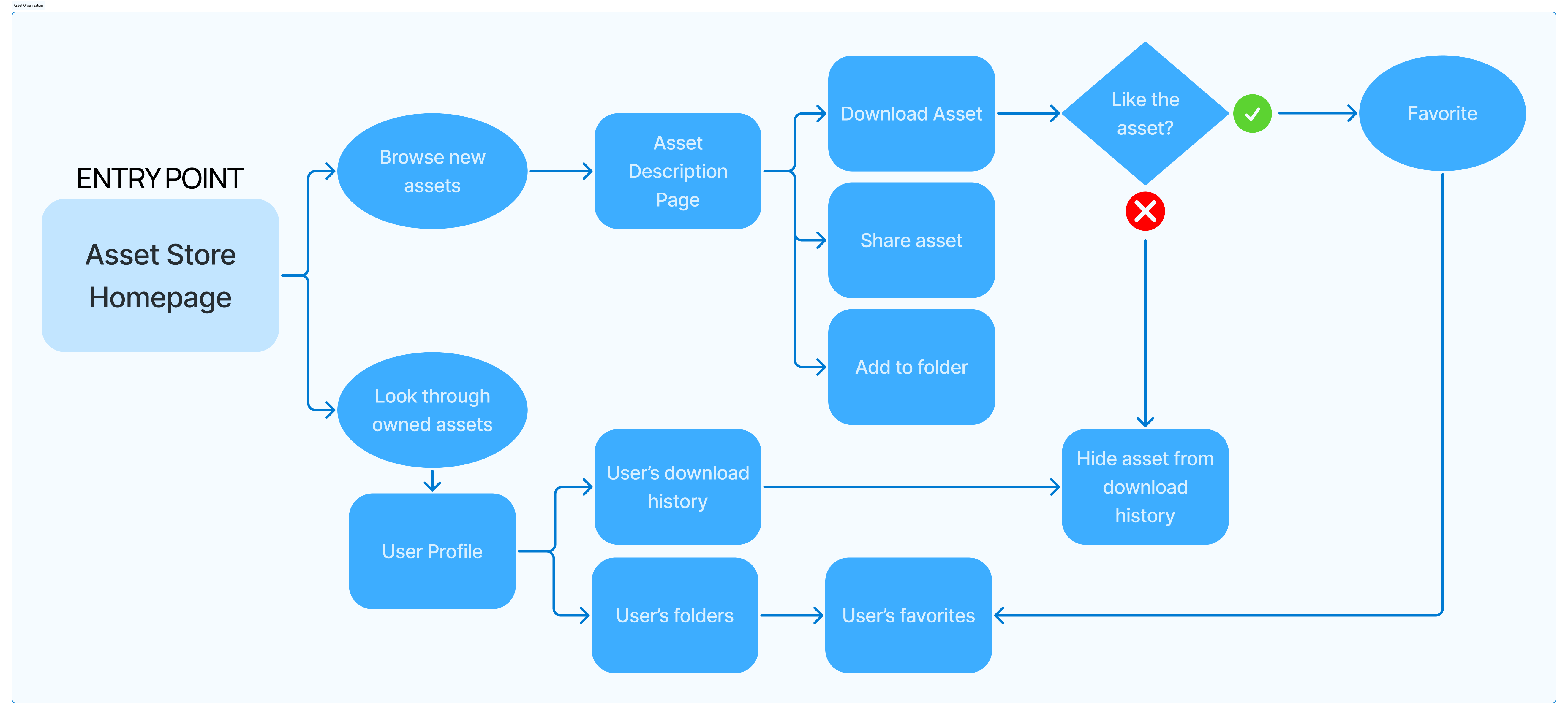
Flow 1: Asset Store Organization
The point of entry for flow 1 is the CSP Asset Store Homepage due to it being the first page that artists land on when in search of assets, whether they are just browsing or searching for old downloaded assets. This flow is designed for both personas. It is informed by Lucia’s need to organize a plethora of assets throughout her long career as an illustrator, as well as Lee’s need to discover new assets and not clutter his space with unused downloads.

Design Goals
Drawing so many UI sketches helped our team understand what parts of the UX flows we designed might work, and what might not work. For example, in Flow 2, we realized that reaching the downloads page might actually be more difficult if we have so much focus on the profile feature. So, we needed to look back at the webpage to rediscover the existing flow and how we could either keep it or reimplement it in a more efficient way. We also took inspiration from competitors and general UI practices to gain ideas on how to format new features, such as client navigation and artist profiles.
Going forward, our redesign would focus on:
Asset organization between CSP Client and Asset Store
CURRENTLY… When assets are downloaded from the CSP store, it is stored in a downloads folder that includes all downloads in their entire history. Artists who want to access their old downloads are required to look through all assets without an option for organization.
IN OUR REDESIGN… we can consider how to improve organization by giving users options for customizing their downloads library.
Improving the client navigation UI
CURRENTLY… During our observation, we noticed that the user was having difficulty navigating the client when trying to demonstrate some features. For example, the user clicked to the wrong page and struggled to find the correct place to access the cloud, which was hidden in some submenus.
IN OUR REDESIGN… we can consider how to improve these submenus to make it easier to get from one place to another.
Adjusting the Artist Profile Page
CURRENTLY… The current system for Artist Profiles is not well integrated within the website - the Profile and Account buttons lead to different pages, and the artist name link on thumbnails does not link directly to the profile. It is also difficult to navigate through the materials created by artists.
IN OUR REDESIGN… we can cater the layout of the artist profile to prioritize displaying their work over their posts to allow collaborators and fans easy access to their materials.
High Fidelity Prototype: Iteration 1
This high-fidelity prototype is a result of taking feedback from our user testing and applying it to our existing UX flows from previous milestones. We focused heavily on our first flow that involved Asset Organization, as we received the most positive feedback for that. Our users appreciated changes to the Asset Organization as it was more impactful to their experience as they regularly access resources posted by other CSP users in their projects.
Main Screens
Home Page
The user flow begins with the general homepage. They can navigate through different sections as they like. Contrary to the current Clip Studio Start portal, the labeling in the side navigation bar is made larger in contrast to the icons, as one of our users during our lo-fi testing stage noted that this change made exploration clearer.
Asset Store Home Page
Users noted that being able to access the asset store from within the client was a useful feature that didn’t currently exist. Our prototype implements our user’s feedback for clear feedback when taking action during the flow. One of the main redesign decisions we made was to include a sub-menu navigation bar on the left side of the asset store so that users can quickly navigate to their downloaded assets and organize them, without having to click through their profile as they have to do in the current version of CSP.
The search bar has “quick filter” buttons so that users can search for the most popular material types amongst CSP users, but the filter button on the search bar expands with further details, just as it does in the current version for the software. However, the filter here has additional details like the popularity ranking of assets according to day/week/month, and a preference for pricing.
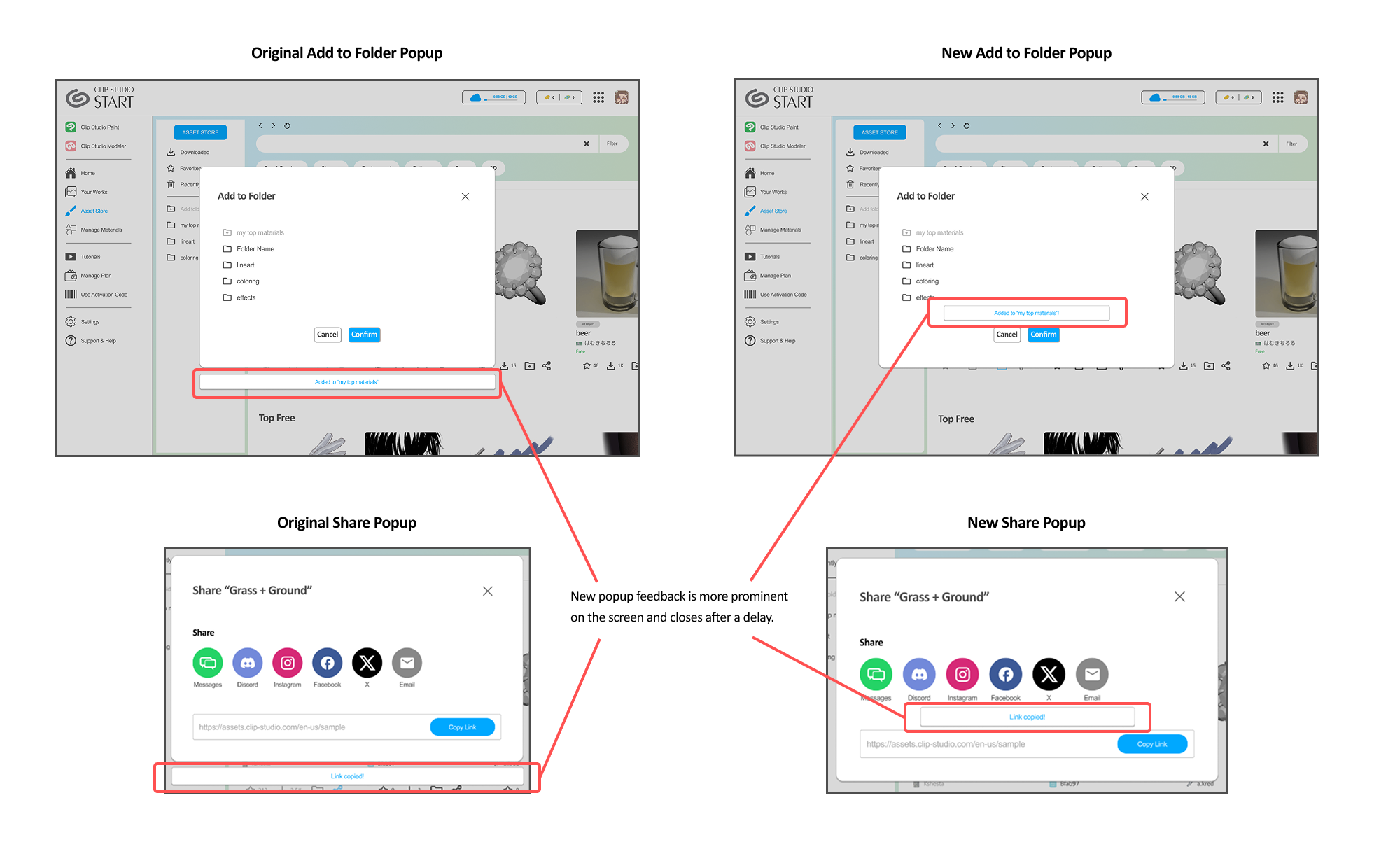
For each of the asset cards, we included 4 quick actions: 1) favorite, 2)download, 3)add to folder, and 4)sharing. These quick actions result in a popup where users can choose what folder to add to when organizing their asset, or how they would like to share an asset. During user testing, users mentioned a pop-up flow would make it much faster to continue exploring the Asset Store. Furthermore, selecting the final action results in a small confirmation popup that can further assure the user of the actions that occurred.
Looking at assets in more detail
After selecting assets, the user can view them in more detail. From this screen, they can also favorite, share, and organize into folders with ease once they have made the decision to download/purchase an asset.
Organizing purchased/downloaded assets
Once assets are downloaded, users can access them in their downloaded assets, where they can organize them into folders. More pop-ups are used here to allow for quick organizing and sharing.
We made the decision to not further develop the “Artist Profile” page to high-fidelity prototyping due to feedback stating that the social aspect of Artist Profiles was not needed, and to concentrate on improving the Asset Organization experience. However, we do believe that the lo-fi versions of the Artist Profile page should be considered as a feature that exists as part of our ideal redesign, as many users expressed their interest in how it could only be an improvement and not a detriment.
Clarification: what is the “Manage Materials” tab for?
A confusing aspect of the Clip Studio Paint experience is the existence of the “Manage Materials” tab. Clip Studio Paint’s asset store is a way for members of the community to create artist resources that everyone can use. You can purchase an asset by downloading it, so from this point going forward we will be using “purchase” and “download” interchangeably.
You can view all historical purchases in the Asset Store from the sub-menu navigation bar we’ve designed, and folder organization also makes it easier for the user to see what materials they already have before they go searching for more.
The Manage Materials tab is for the materials the user has downloaded to the device they are currently using. This tab essentially just allows them to sort the files stored on their computer. If they have purchased an asset before but don’t currently have it downloaded to their device, then that asset would be in the sub-menu of the Asset Store and whatever folders it was sorted into, but not in the Manage Materials tab of the user’s current device.
Alternative Screens: A Merged Concept
Because the separation of a Manage Materials tab can be so confusing, we wanted to explore a design where the Asset Store is combined with the Materials tab to make the process of organizing purchased materials run more smoothly. This way, a user can find an asset, download it, and then go directly to their material folder to find it, or vice versa. A user could search through their existing materials and find the asset store page for it right away. Or, they could view the store page details in the same window.
Screen 1 - Materials Tab
In this merged alternative, the sub-menu navigation bar is the main way to switch between the Asset Store and materials installed on the user’s device.
Screen 2 - Merged Concept, Asset Store and Alternative Filter
The second alternate screen examines a different way to browse the asset store. We took inspiration from online retail stores and converted the sidebar submenu to a filter list. For users who are browsing for new assets, the filters can help narrow down their search to something that is popular with others, something that is within their budget, or even give them guidance on what they might want to be looking for. We want our users to let us know if they find a sticky filter sidebar useful for browsing the asset store.
Hi-Fi User Testing Feedback & Implementation
For our user testing, we had 2 participants explore through the interface, as well as have them do a side-by-side comparison with the alternative screens. With both the user testing and comments that we received from our TA and classmates, we conceded the information into a few key points. Along with those key points, our team decided to adjust our screens based on some of the feedback that was given.
Before and After
Pop-Ups
Users enjoyed the cleanliness and simplicity of the user interface, especially the pop-ups so they would not have to click the brush to access an action.
Our team also decided to change the location of the pop-up message so feedback is more clear and prominent to the user.

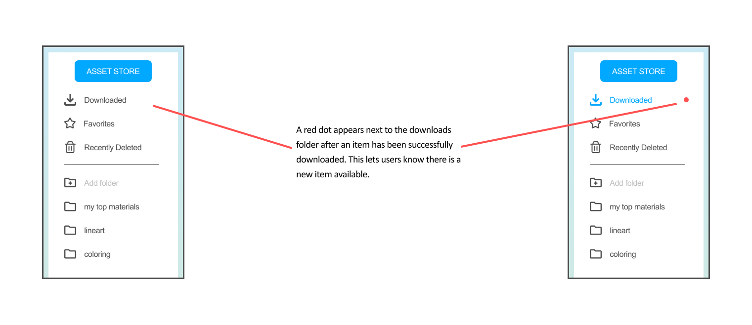
Download Notification
Users appreciate the notification that appears next to download to indicate where the asset is located after downloading it from our alternative screen. Hence, our team decided to add the additional notification feature so that users can comprehensively locate where the asset is being downloaded.


Brush Display Page
A user mentioned that the space underneath the “download” button is huge and could be more aligned with the bottom left tags.
However, our team decided to keep the alignment of the button to the middle right of the screen like CSP’s version since it appears more visible and makes the component along with the other information it on the top of the brush page look more full.
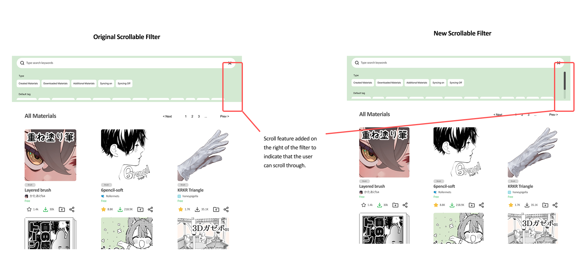
Filters
Users did not have a preference for both our drop-down filters and scrollable filters. One of them claimed that if he wanted more specificity with filters, he would prefer the scrollable option, whereas for a cleaner look and basing the filter solely on types, they would prefer the other. He also mentioned that including a scroll feature on the right of the tags would be helpful so that users can scroll through the tags.

The Verdict: Merged vs Separate Assets & Materials
To remind the difference between these two systems, CSP has “Asset” as the entry for its online assets store. When a user favorites or downloads assets under their profile in the Asset Store, it would appear across all devices. However, the assets that appear on Manage Materials would only appear on the device that the user is currently using. Unless they sync that asset to their cloud, it is inaccessible, and the user would have to locate that brush under their profile in the asset store if they had it favorited or downloaded.
That being said, one user chose to keep Assets and Materials merged at first, but after explaining their purposes, the user switched to keeping them separated. However, they noted that there were some overlaps with their function and wondered if there was a more convenient way to simplify the user flow since they have a lot of overlaps. They also mentioned the pain of syncing assets saved on the cloud to their local devices.
Another user did not state any preference but pointed out that if having them merged, it would be best to change the wording from “Materials” to “Your Materials” or “Your Assets” signifying that these are ones the user already owned while the “Asset” is the Asset store.
Final Prototype
Link to Final Prototype: Our final prototype illustrates the experience of opening up the Asset Store and installing a new brush material called “Grass + Ground.”
Conclusion and Final Remarks
Circling back to our problem statement and POV statement:
Illustrators need a low maintenance organizational system that will allow them to create, use, and share tools with their peers so that they can continue improving their toolkits and share their knowledge with their artist community.
We believe that artists prioritize accessibility to assets they are interested in and want to limit unnecessary information that might appear along the way. The ability to spend less time searching through vast libraries that are inaccessible from their main workspace can encourage them to keep drawing.
Our problem statement highlights the need for efficient organization as a response to our initial illustrator's frustration with spending so much time sorting through downloaded assets from the Clip Studio Asset Store. Our solution addresses this issue by implementing a robust file organization system that makes it possible to customize folders to categorize all downloaded assets.
We also take advantage of a unique submenu functionality that clearly illustrates a workflow from the homepage to the Asset Store, so that users can explore the store to their heart's desire while quickly being able to access their organized downloads without having to click away.
After user testing, were able to validate that our ideas brainstormed from the problem statement were valuable changes to the user base. From this, our POV statement let us further empathize with the artist's desire to spend as much time working on their craft by minimizing the time it took to look through their resources. With this in mind, we honed in on extra details like feedback pop-ups to let users quick-add assets to folders and share them with peers and friends in just a few clicks. We also took care in creating filters that would let artists search through materials in a more specific, but still broadly enough to cater to their current needs.
Overall, we are happy with the reception we received from the final two artists who took a look at our high-fidelity prototype. These results indicate that the needs we identified were genuine, and that if Clip Studio were to implement or take inspiration from our proposed re-design, their user base would enjoy an improved quality of life.
Unfortunately, due to our lack of time, we were unable to fully address the issue that some users had with distinguishing the Asset tab from the Manage Materials tab. Understandably, it is a misleading workflow to go from your purchase history to your device downloads only to find that you still have to keep track of whether or not a material is currently installed and usable on your device. However, it is also understandable that the creators of Clip Studio designed this environment so users would not get confused between the store functionality and the ability to manipulate files already downloaded to your device. If we had the time, we would have loved to explore and refine the concept of a merged Asset and Materials tab like we envisioned in our alternate high-fidelity screens, to further reduce the time an artist would need to take to look for just the right material they need to finish their project.


